Illustrating Information
Representing sophisticated concepts from Science and Mathematics
The challenge in illustrating information is matching complex ideas with simple visual structures that convey the key concept(s), and nothing more. When done well they embody an austere beauty. Their richness arises with insights gained in an engaged audience. Most of the examples below were drawn for Shawn’s Science of Paddling blog.

Trilateration – determining position from 3 GPS satellites
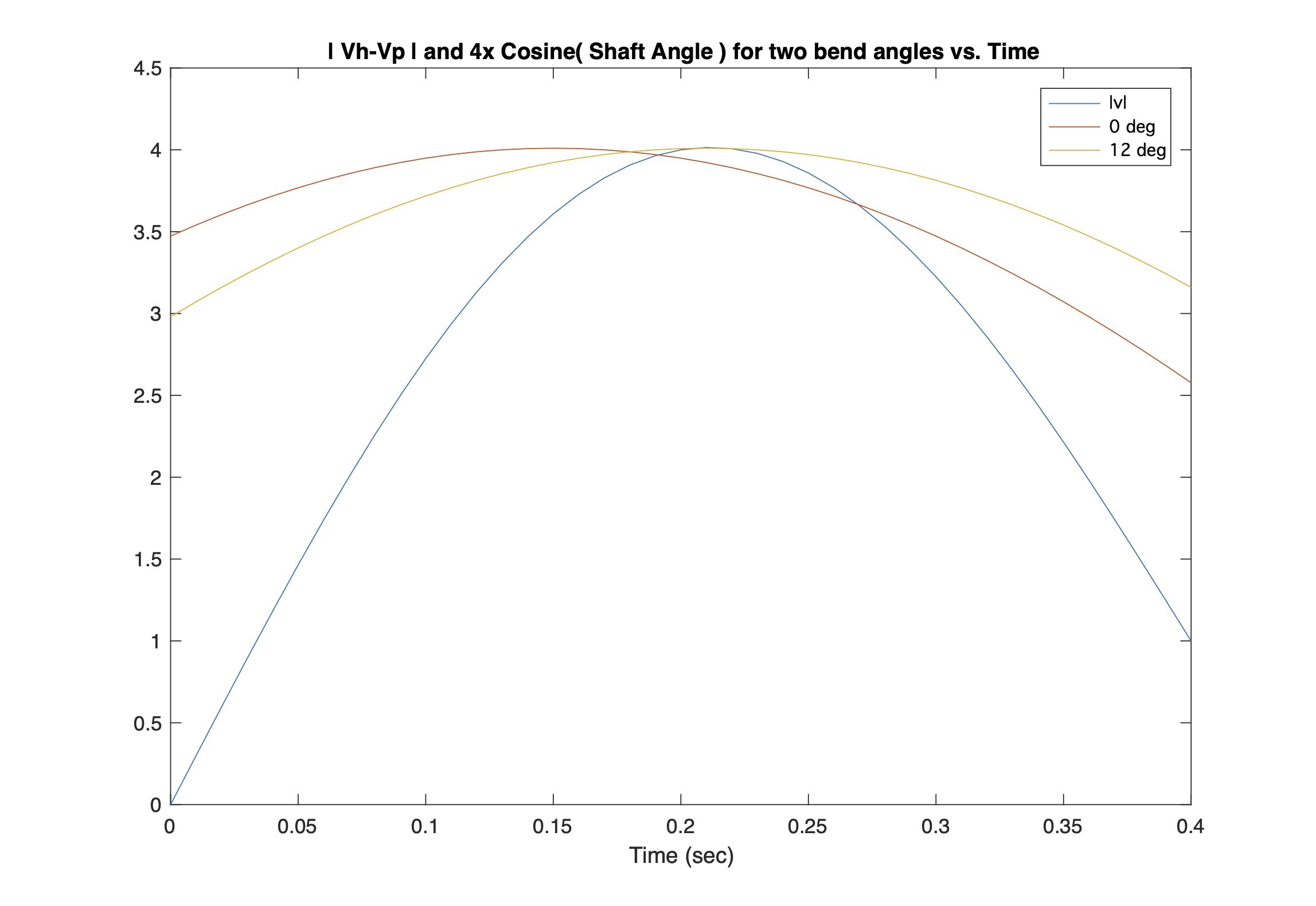
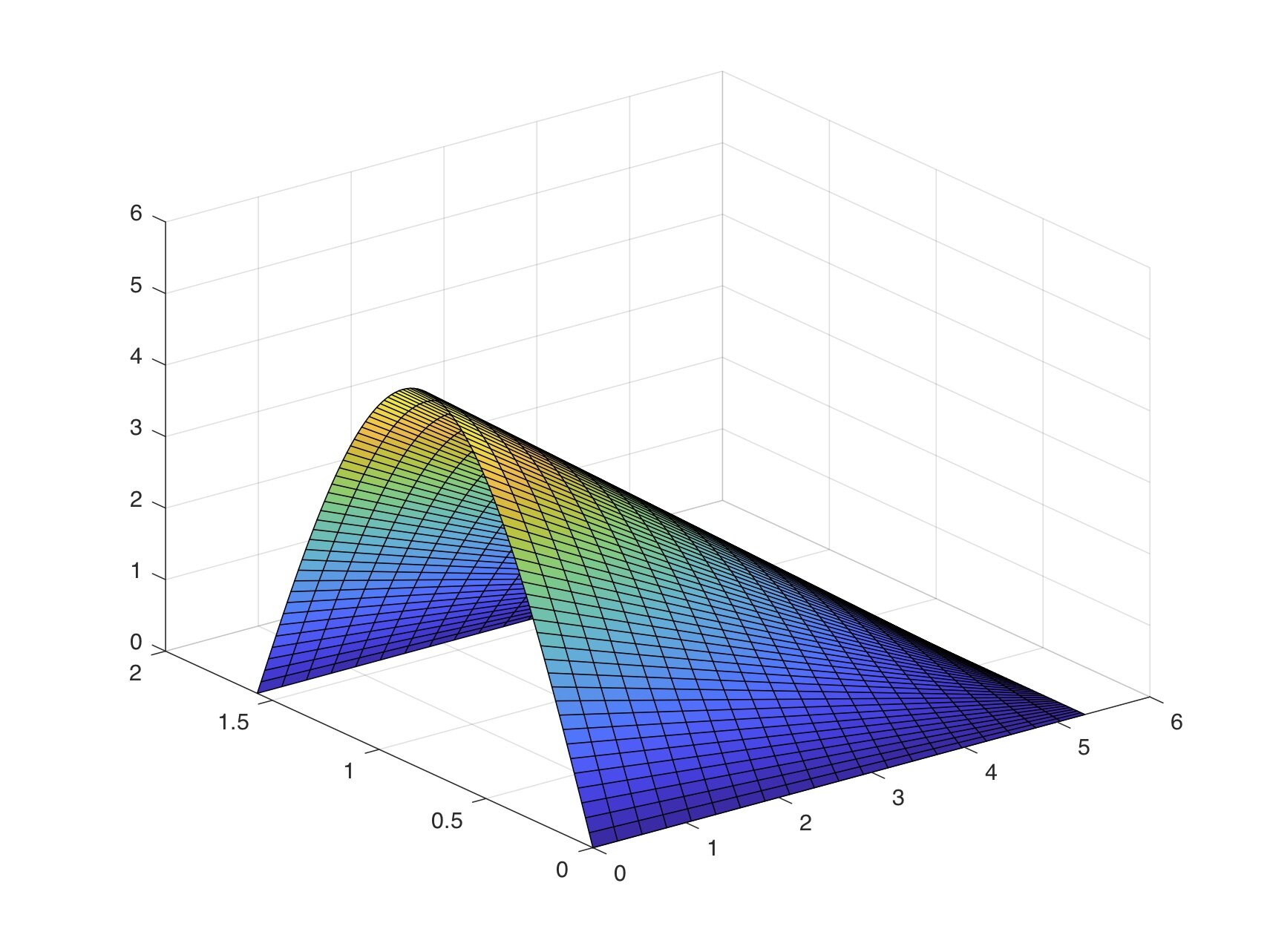
Role of paddle bend angle in maximizing blade force

Superposition of bow and stern waves with increasing speed
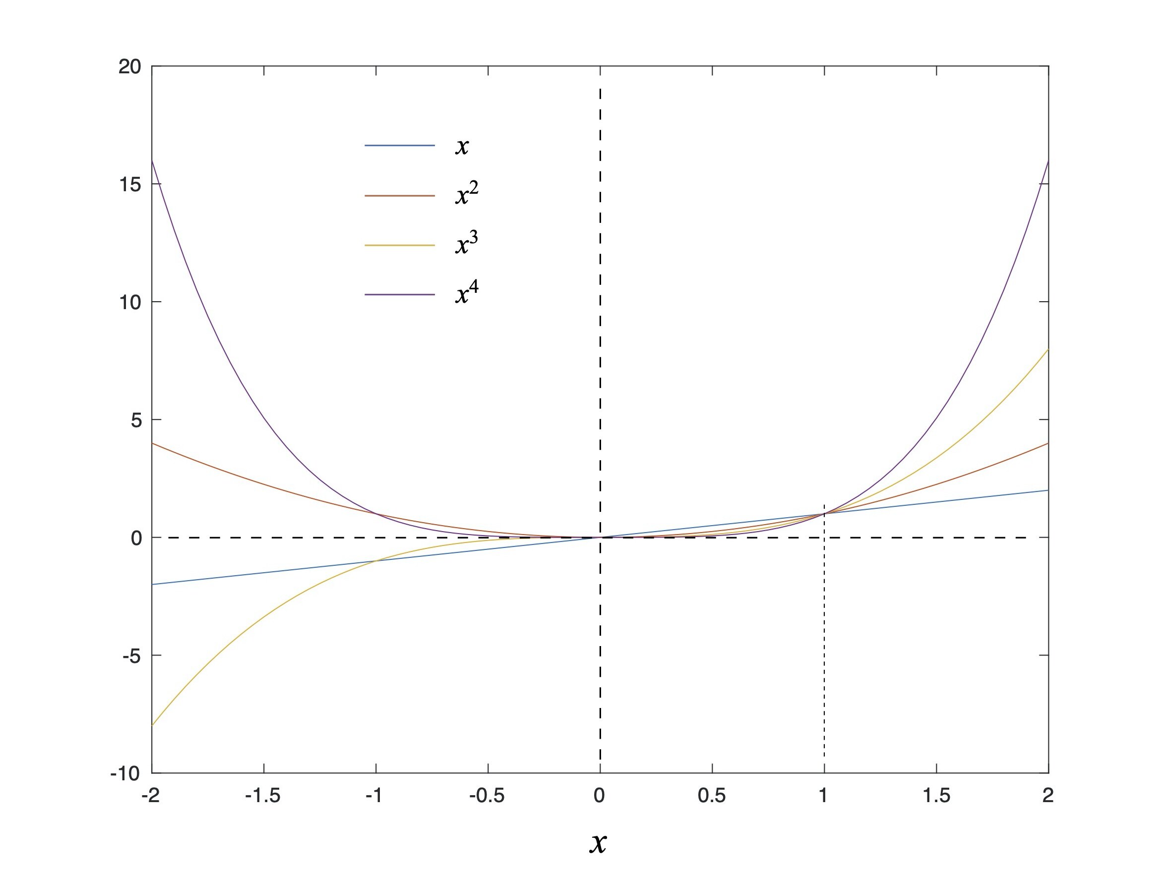
Plot of powers of 'x'
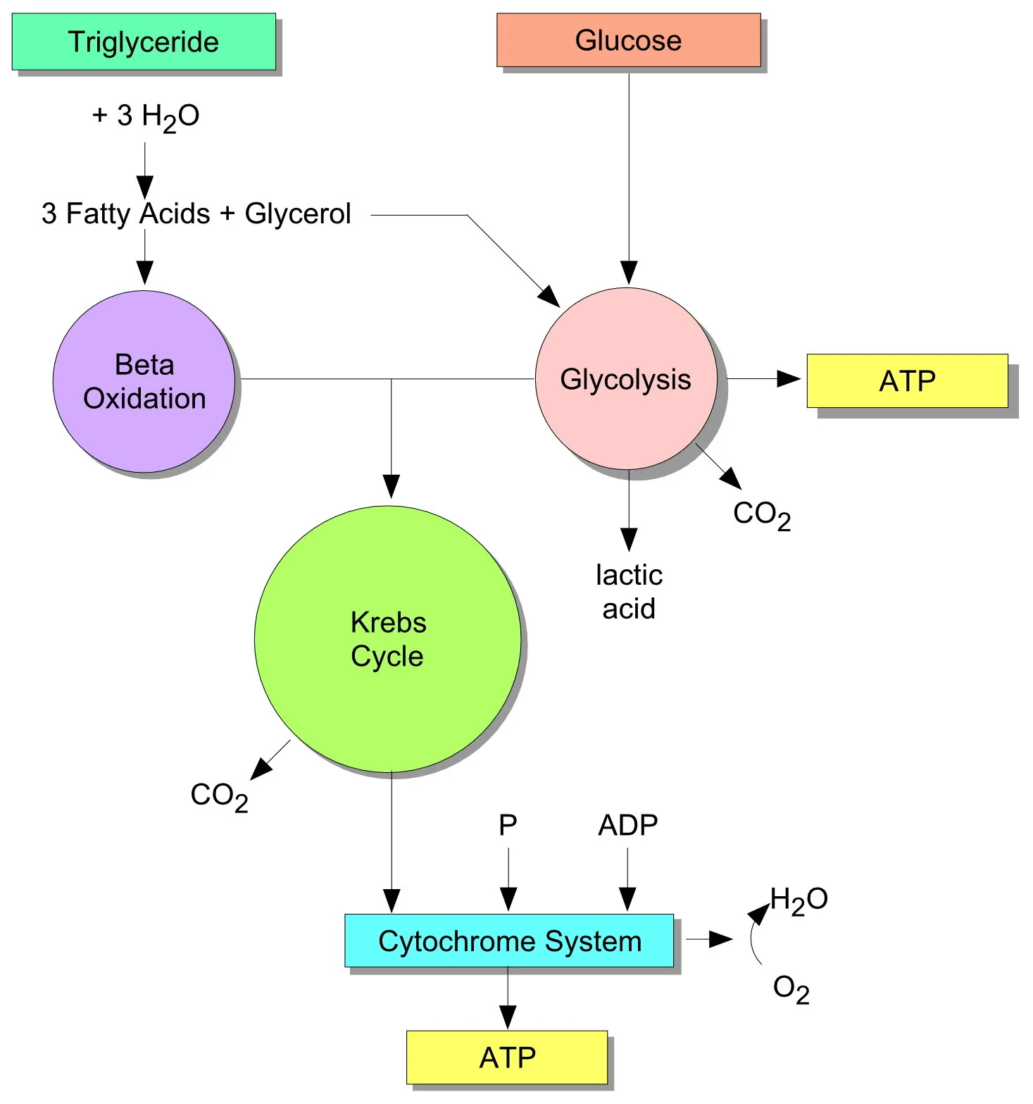
Combined metabolic cycles
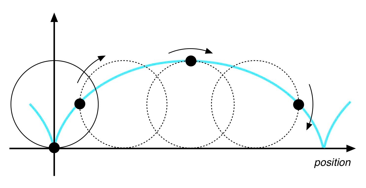
Constructing a cycloid from a rolling cylinder

Kelvin waves

Pseudo-random noise code timing offset from two GPS satellites

The classic coupled double pendulum dynamics problem
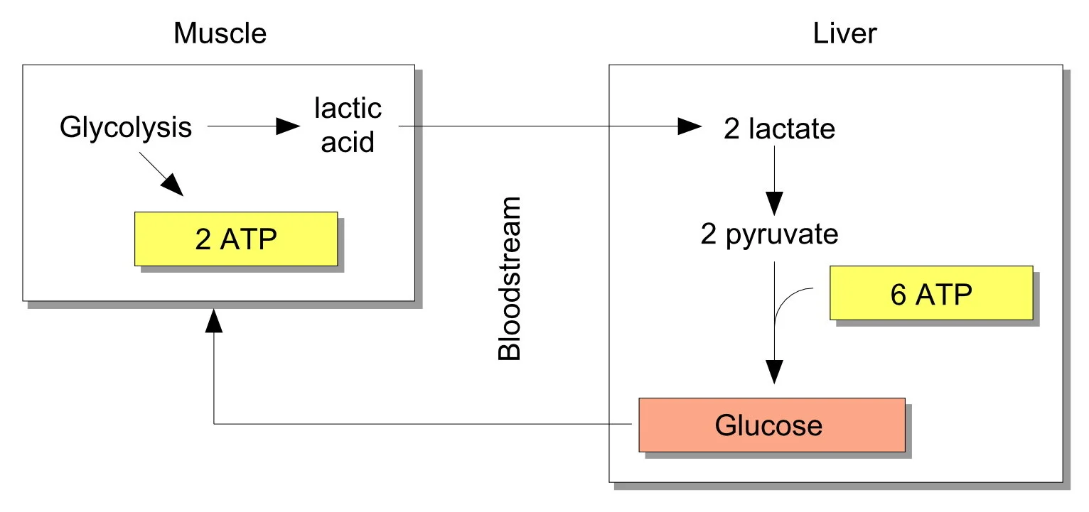
Cori metabolic cycle
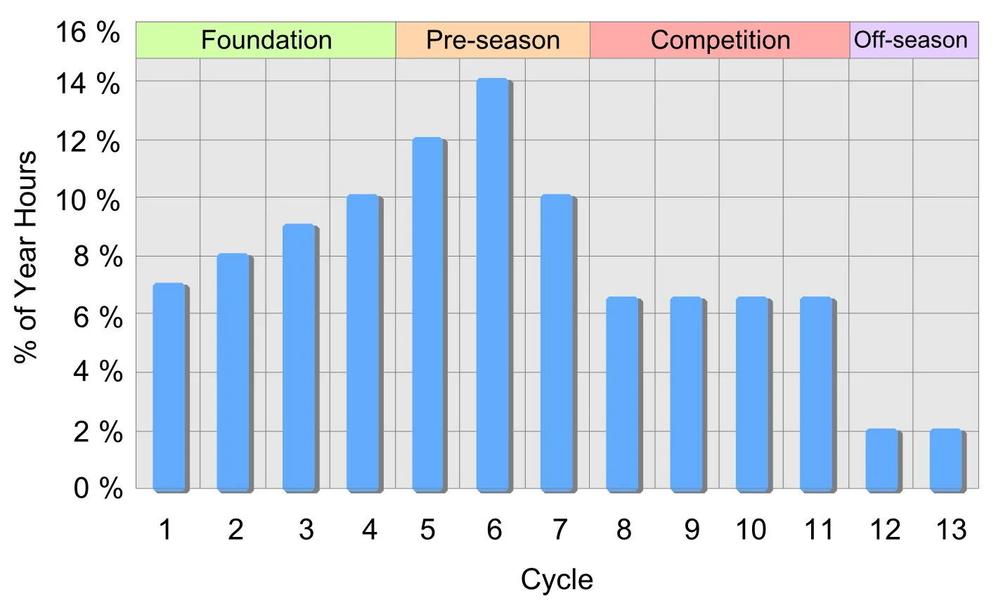
Exercise volume periodization over a year
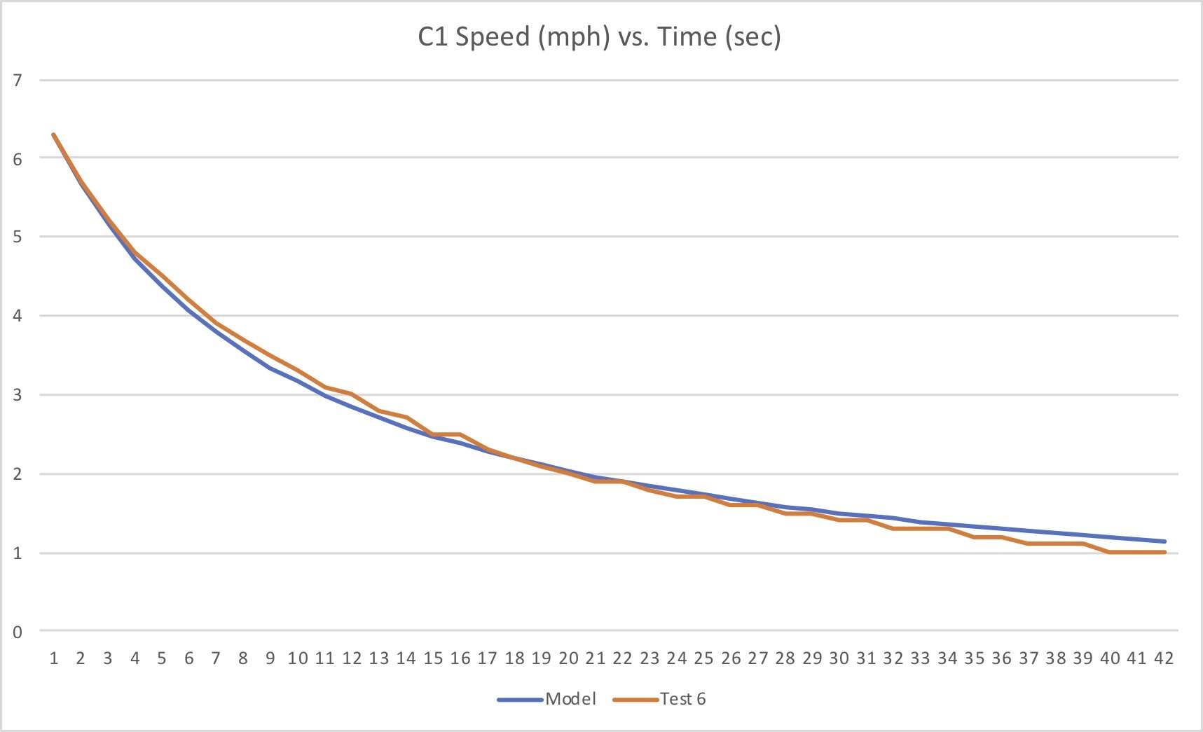
Hull drag: theory vs. experiment

Boundary layer development

Buoyancy force movement with hull roll
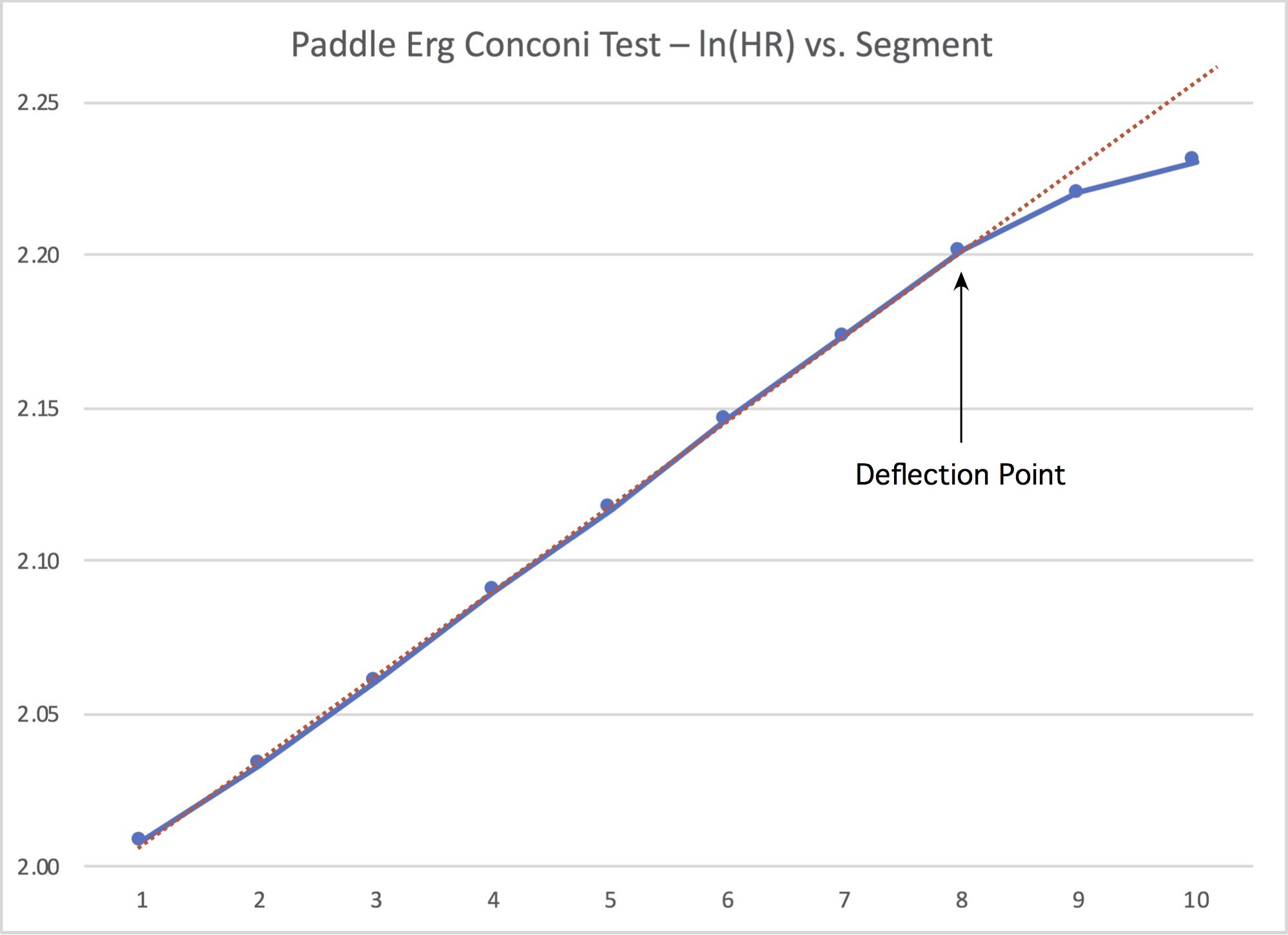
Heart rate deflection point for paddling

Perspective view of hull and wake with control volumes and surfaces
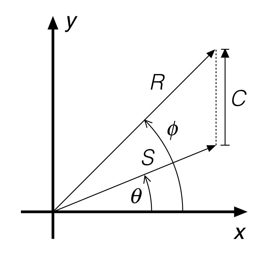
Vector addition
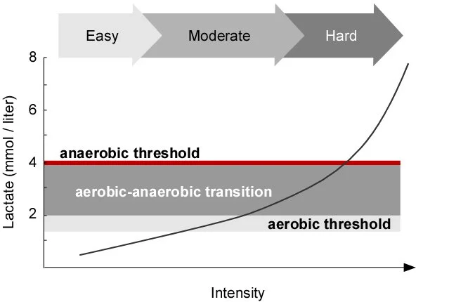
Qualitative representation of metabolic exercise thresholds

Hyperbolic tangent and a linear approximation for small arguments